We’ve previously looked at how to decorate a kid’s room on a tight budget. This time we’re exploring the nuances of themed rooms. We are going to be looking at the differences between a little “themish” and a lot “themey”.

In my short time as a parent (approaching 6 years) I’ve already observed the raging obsession and subsequent indifference over Toy Story, Dinosaur Train, robots, and now Star Wars. It would seem that kids tend to get really into things and then grow and move on to another interest. This boom/bust cycle alone would be enough to warrant a suggestion to avoid “going crazy” with the theme when decorating a kid’s room. When you add in that a “too themey” room can go against a lot of the rules for interior design, then it makes it an easy decision to take it down a notch.
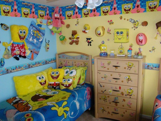
Here is an example of a room that has fully commited to the theme. I am pretty sure I don’t need to tell you at all what the theme is.

It looks like a lot of work to decorate a room that way. But it also takes work to successfully create a Spongebob Squarepants (or any theme) room that incorporates solid interior design principles. One key is that you have to more thoroughly understand the theme. For example, an easy wall decoration would be to use a big Spongebob Fathead on the wall. However, knowing that Spongebob lives in a pineapple under the sea, a more design appropriate choice would be this wallpaper below. The blue mimics the sea and the pineapple graphics are fun enough to work in a kids room but are also modern and cool design.
Another example is how you approach wall art. Again, you could use a giant Spongebob poster or sticker, there are a lot of options. But if we think about this with interior design in mind we might choose instead to use yellow painted picture frames. These yellow rectangles represent our good pal Mr. Squarepants and certainly add to the theme, but you can fill the frames with family pictures or any image you want. Even leaving the frames empty would be a nice design element.
Other design elements that you could use would be a rectangular yellow rug, or a fish tank or a potted indoor palm tree. A square yellow lamp over a square brown base would be a nice homage to Spongebob.

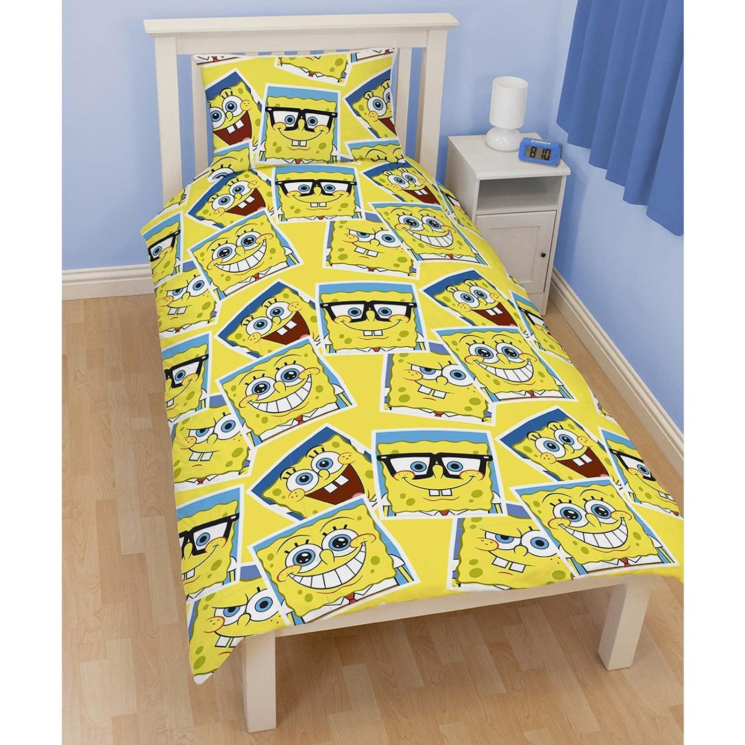
For the bedding I think it is a great time to give the kids what they want and put some Spongebob sheets and pillow cases on there. The bedding is something that is easy enough to swap out if tastes change. We would go with something like these sheets available at Amazon:

At Epoch Design we make furniture that is built to last a lifetime. We also strive to have the styling of our furniture be both modern but also one that won’t go out of favor. We’ve discussed a suggested strategy of having your furniture be a solid staple that you accessorize around – like a classic black dress or navy suit. That is the way we approach kids rooms too. We want the “bones” of the room, the foundation of the design, to be solid and classic. From there we can make things fun and wild. And that is really where the fun of designing a room lies. Be imaginative, be creative, be a kid again. Have fun decorating!

